Posts

Showing posts from August, 2017

Packaging #17 - Label in a can

Image
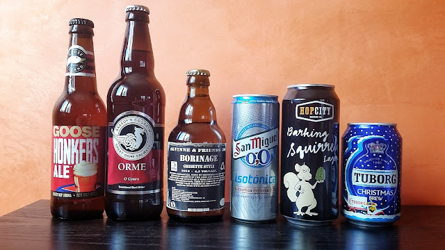
Zipper, with a frankly improveable look, although it probably is the best hazy I have tried. By its side, Bellini Vice, atractive and nice. With the expansion of craft cans, we get a new type of finish for cans. If the industry had us accustomed to cans with a homogeneous look, with a print on the same metal - sometimes better than in others -, the world of craft beer and its inexhaustible thirst for new daily recipes has brought us a new element that obviously seeks to cheapen costs .

Packaging #16 - 360 End

Image
When I set the standard of packaging for cans I commented that the gap through which the beer flows out could be of greater or lesser amplitude. One of the variations that comes out of this 'normality' is that in which the upper part of the can gets completely uncovered, with the gap as wide as the container itself. A great invention, from a California packaging solutions company - Crown -, which has the graphic name 360 ​​End .

Packaging #15 - Widget

Image
After reviewing an external element to cans , let's see one that rests within it . A small device that came to market in the middle of the last century, which has a certain function that has not always been well understood by the final consumer, some of which having even expressed their surprise and disgust by saying ' there is something in my beer '. It's true.

Packaging #14 - Protective lid

Image
After the previous post, it is time to leave behind - for now - the bottles and explore the cans , a packaging format for which we will review up to four different presentation elements. And to begin with a very useful one, which to some extent gives continuity to the obsession for hygiene that every brewer should have when it comes to brewing.

Packaging #13 - Cold indicator

Image
After eight different posts reviewing caps, unless I'm wrong I think we have covered all the varieties which I have come across during my life as a drinker. It is thus the perfect moment to move on and see other elements of presentation . And today's widget will play a transition, since it can be found in both bottles and cans.

Packaging #12 - Wood-aged cap

Image
At this point, it might seem that in the previous entries we have already covered all the possible caps to be found in a bottle of beer. But to think so would show a lack of knowledge and consideration to craft breweries, which always surprise us with novelties in every possible flank, such as a gadget that gives a touch of wood aging to bottled beer.

Packaging #11 - Reusable cap (2)

Image
Yesterday I expressed that I could not understand why someone might find it interesting to want to cover a bottle of individual capacity - less than 50 cl -, but there can always be exceptions in this life, as shown by the second alternative of reusable cap to explore: the mythical Tactical Nuclear Penguin by Brewdog.

Packaging #10 - Reusable cap (1)

Image
Sometimes we are faced with the following situation: we have a bottle of beer ready to be enjoyed, and we want to uncap it. But for whatever reason, we are aware that we will not be able to drink the whole beer , or that if we do it will be at the cost of getting us minimally intoxicated.

Packaging #09 - Cork cap

Image
Collectible items. I don't think I know anybody who keeps the wire. Here is a presentation element much more associated with wine than beer ; although it has been there for a long time in brewing traditions like the Belgian, and to this day it is very widespread with the irruption of the craft scene in different countries. The cork cap is usually found in 75 cl bottles - 37.5 cl, alternatively - something marvelous in neophytes' eyes who, delighted, indeed say that with that presentation it looks more like a wine than a beer.

Packaging #08 - Ring pull cap

Image
Today's packaging element is relatively new  in our local market and, yet again, has practicality as its best bet. Although, unlike the one we saw in the previous post , it achieves its purpose with no problems.

Packaging #07 - Twist cap

Image
Twist at your own risk vs do not be thick. Let's now review an element that clearly demonstrates that, at the very least, one must be suspicious of marketing. It is best not to confuse today's element, the twist cap , with the screw cap  we saw yesterday: while the latter is a great ally for fun and outdoor life, the former can become the worst of your enemies.

Packaging #06 - Screw cap

Image
The litre bottle cap , so that we get it clear. That element that you playfully throw to your friends when you are in the field or on a BBQ, or with which you entertain yourself at the table when you are drinking a shandy with your family in summer.

Packaging #05 - Hanging label

Image
An interesting category of elements are those labels that accompany a bottle but, instead of being attached to it, are hanging with a thread or ribbon around the neck , with more or less taste and harmony with the whole set, depending on each case .

Packaging #04 - Wrapping

Image
Today's packaging element could have easily fallen into the category of 'adornments' , if not for a small aspect that disallows it to enter the most useless category of all. And it is that the paper does have at least a remarkable utility , beyond beautifying.

Packaging #03 - Adornments

Image
Sorted by uncapping difficulty. I was unsure about how to name this category. But since these are very different elements among them, with the only common aspect of having no practical use beyond decorating , 'adornments' seemed to fit more or less. And what kind of elements fall into adornments? Especially, we find elements that wrap the top : from the easy-open plastic - that, we all know, sometimes it can lead to desperation - to glued aluminium foil. The latter are quite common in traditional breweries, and are constantly agressed by breweriana collectors who want to check whether or not the crown cap underneath is customised.

Packaging #02 - Flip top

Image
One of the variations on the standard of packaging that brings more elegance to beer is, no doubt, the flip top . With a simple mechanism based on a rigid wire, it manages to close the container tightly with a top that, historically, was mostly made of light coloured ceramic. But time has relegated it to a cheap, simple piece of plastic.

Packaging #01 - Standard

Image
Standard presentation for beer. Note: first and last time that these same six beers will be side-by-side. To begin with, let's briefly review the baseline scenario . What we might call a 'normal' or 'standard' presentation for a beer. When we drink bottled beer, what we usually find is a glass bottle ranging between 20 cl and 75 cl : either transparent, green, brown or almost black, with a label that provides some information and a metal top covered with a plastic or rubber inside part - previously cork -. The label - that can even be textured if they spend extra money... and allocate it back to the consumer, of course - is usually presented in one piece, or with a front label and another on the back. A small, additional one can be found in the collar, indicating that a brewery earns its dough.

Packaging #00 - Intro

Image
For the present month, I thought of developing a series of mini posts: with a common background topic, and brief in content . While also looking for a certain degree of reflection, the idea was to make lighter publications: session posts, to give it an absurd name, in line with what we do with certain beers.